Visual representation of data is an integral part of data analysis and often influences critical decisions in businesses. With tons of charts out there, the Marimekko chart stands out for its unique ability to display varying categorical dimensions and their relationships in one view. Keep reading to learn more about this powerful visualization tool.
Table of Contents
Understanding the Concept of Marimekko Charts
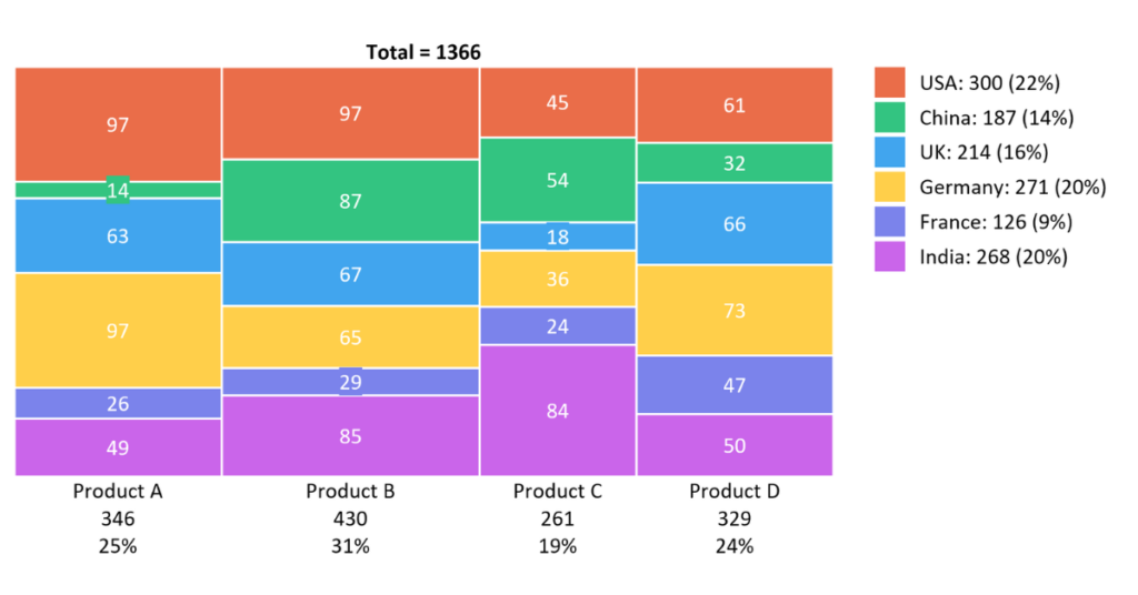
Alt Text: An image depicting an example of a Marimekko chart
A Marimekko chart, also known as a Mosaic chart, is more than just a visual representation of data. It is a unique tool that showcases two-dimensional data in a way that enhances understanding of correlations and outcomes. The chart gets its name from Marimekko, a Finnish design company known for its original prints and colors.
In a nutshell, a Marimekko chart is designed to display categorical data through both horizontal and vertical rectangle lengths and widths. The height and width of the rectangles are proportional to the data values they represent, offering a broad view of the data landscape.
This powerful chart allows users to analyze and compare different variables simultaneously. It provides an in-depth review of the data structure and unveils underlying patterns and trends that might escape the naked eye.
Marimekko charts are powerful data visualization tools that translate data into visuals and allow businesses to identify market growth opportunities, track market share changes, and conduct competitive analysis effectively.
Essential Components of Marimekko Charts
The successful construction of a Marimekko chart depends on a few key components. First is the category axis that divides the chart into vertical columns, known commonly as blocks. The block divides further into rectangles representing subcategories.
The value axis represents the numeric value associated with each subcategory. It determines the height of the rectangles within each block, and its scale is identical across all blocks.
Another vital component is the segment, a collection of adjacent rectangles grouped within a block. It portrays a specific class of data and offers comparative metrics across various segments.
Lastly, the color scheme used to distinguish between different blocks and segments within those blocks plays a significant role in facilitating data interpretation. A well-planned color scheme ensures a clear and straightforward analysis.
The Underlying Principle and Basic Structure of Marimekko Charts
A Marimekko chart operates on a simple principle: the representation of data in varying dimensions. The chart presents data across two categories, with each category occupying either the width or height of the chart. This dual categorization allows the chart to showcase different dimensions of the data set simultaneously.
The foundation of a Marimekko chart is a grid of rectangles. Each rectangle forms a segment of the chart and symbolizes certain data points. The size of the rectangle is directly proportional to the data it represents, offering a valuable visual comparison.
One useful feature of the Marimekko chart is its ability to handle non-numeric categories effortlessly. The width of each segment (or block of rectangles) corresponds to a category, and its height to an associated numeric value. This feature makes this chart a brilliant tool for presenting diversity in data patterns.
Precision is key in a Marimekko chart. The collective width and height of each adjacent sector must add up to 100%, ensuring a proportionate distribution of data. This creates a compelling visual effect that allows easy comprehension and inferences from the data.
Practical Application of Marimekko Charts
Alt Text: Business professionals review sales data extracted from a Marimekko chart
The chart presents an excellent platform to showcase company performance, market segments, and sales data with transparency and clarity that can effectively aid in data-driven decision-making and trend spotting. Let’s take a simple example to illustrate the practical application of Marimekko charts: Understanding the market shares of different companies across regions. With multiple companies and regions to analyze, this could easily turn into a convoluted process.
Utilizing a Marimekko chart, the blocks would represent different regions, and the rectangles within those blocks would portray the various companies. The size of those rectangles would denote the market share of each company in the specific region.
In such a chart, a single glance would highlight the region-wise distribution of market shares and the overall market position of each company. It would be clearly visible which company holds the most substantial share in which region, enabling quick comparisons across regions and companies.
Altogether, understanding Marimekko charts and their construction requires careful study, but the rewards are immense. These visually dynamic charts can transform volumes of complex data into comprehensible views, making them an invaluable asset in data analysis and business decision-making.


